High-fidelity UI/UX Design for Web and Mobile Platforms
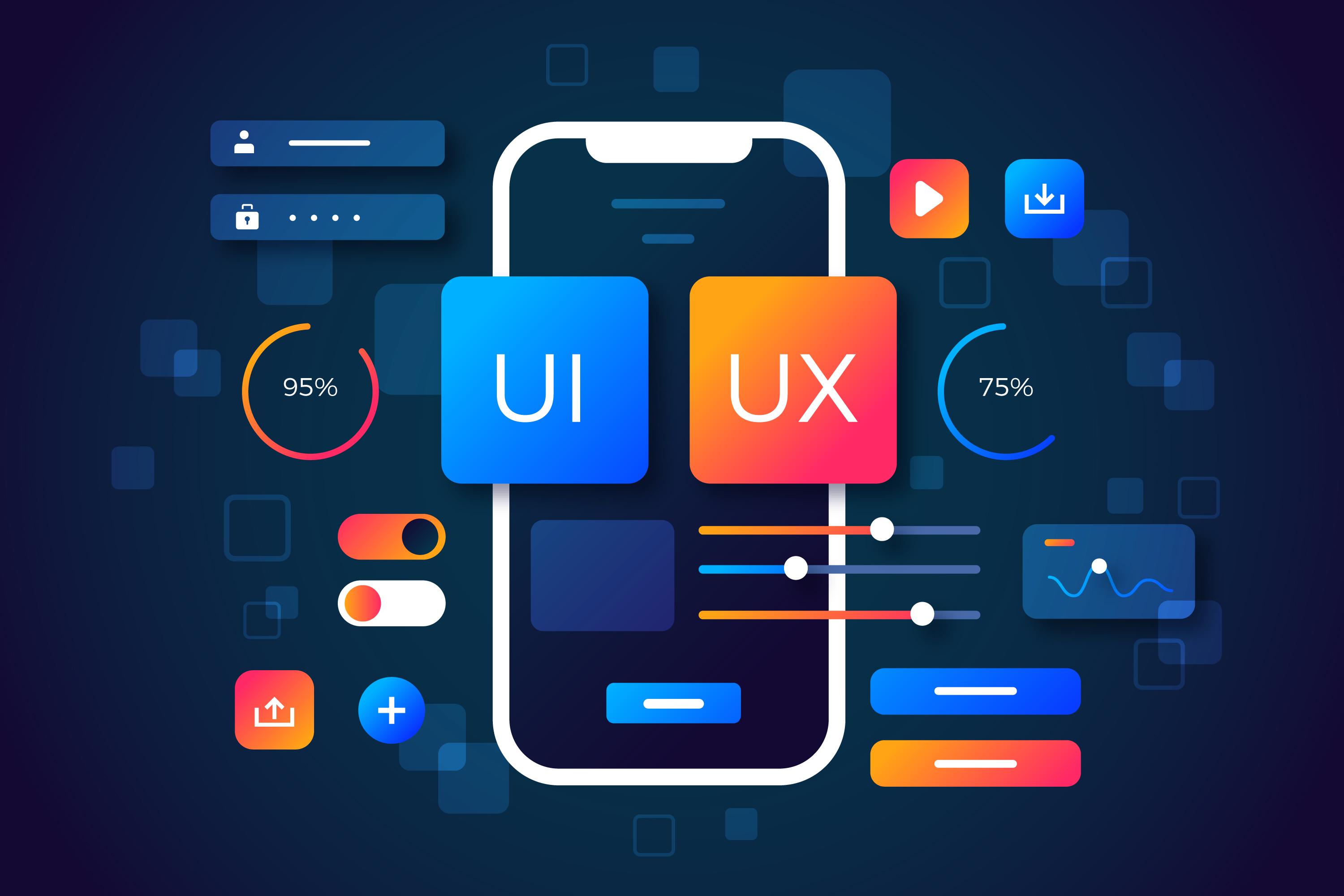
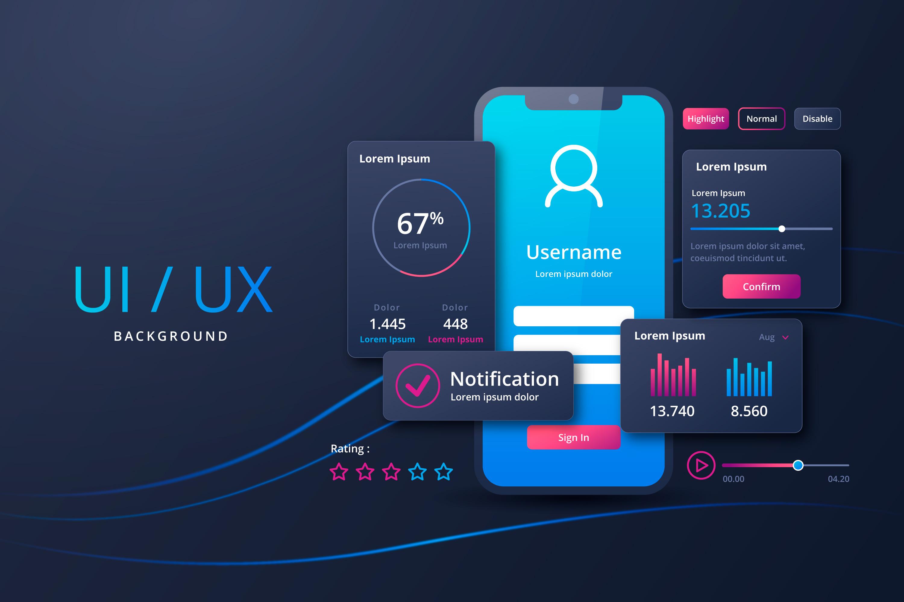
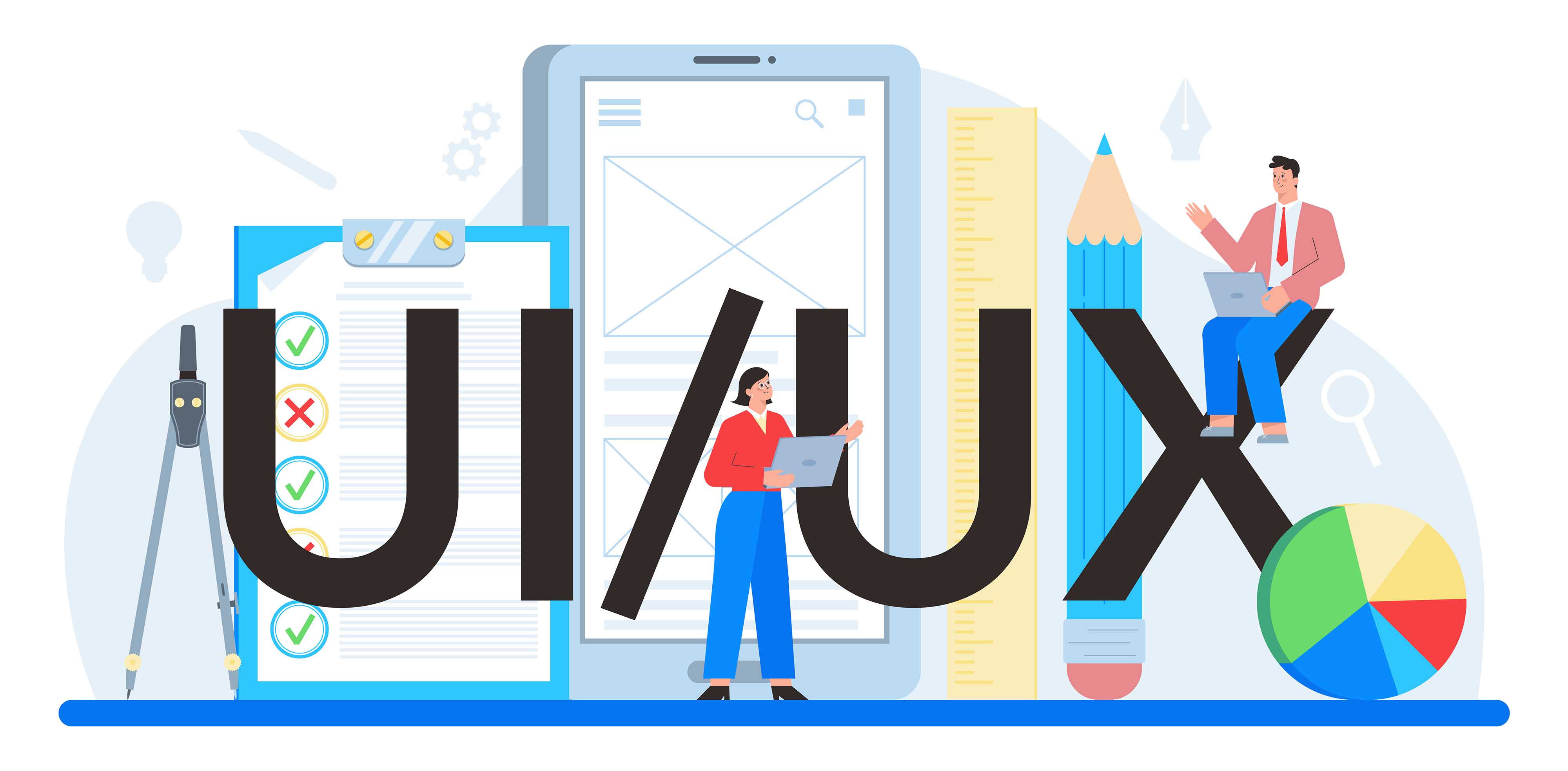
User Interface/User Experience (UI/UX)
Experience Design, Refined.
Great design is invisible—it’s the seamless glide from a landing page to a "Purchase Complete" button. At Skylit Online, we specialize in high-fidelity UI/UX design for web and mobile platforms that bridges the gap between human psychology and digital functionality.
Using the industry's most refined toolkits—including Figma, Framer, and Adobe Creative Cloud — we transform complex business requirements into elegant, user-centric interfaces. We don’t just "push pixels"; we build Design Systems that scale and interactive prototypes that breathe life into your vision before a single line of code is written.
Our Design Philosophy
User-First Research: We don't guess; we validate through user personas and journey mapping.
Platform Agnostic: Whether it's a sleek iOS app or a complex SaaS dashboard, the experience remains consistent.
Prototyping Excellence: We use high-fidelity motion design to show exactly how your product will feel in the user's hand.
Developer-Ready Handoff: Our files are organized, documented, and ready for your engineering team to build without friction.
Frequently Asked Questions
Think of it this way: UX (User Experience) is the logic and structure—the blueprint of the house. UI (User Interface) is the interior design—the colors, buttons, and visual delight that make you want to stay there. At Skylit Online, we never do one without the other.
We stay on the cutting edge. Our primary workspace is Figma for collaborative design and prototyping. For high-end interactions and "no-code" live previews, we utilize Framer. For complex logic and user testing, we dive into Protopie or Adobe XD when requested.
Yes. We follow Apple’s Human Interface Guidelines and Google’s Material Design standards to ensure your app feels "native" and intuitive on whichever device your customer chooses.
Absolutely. We use "Live Prototypes," which means you’ll receive a link where you can click through the app on your own phone or browser as we build it. It’s the best way to get a "feel" for the product in real-time.
While our primary focus is the Design & Strategy phase, we pride ourselves on "Dev-Friendly" handoffs. We provide your developers with all assets, CSS snippets, spacing tokens, and asset exports needed to make the transition from design to code flawless. (If you do need development, ask us about our Webflow & WordPress implementation services!)
Selected Projects

Nuvoni Research

Soralo

Baringo County Conservancies Association
If you are interested in working together, Say Hi at hello@skylit.online
Design Packages
All In Design
From
$3,000
Contact Us for a Quote
Get a Free UI/UX Quote
Tell us about your project and our team will respond within 24 hours.